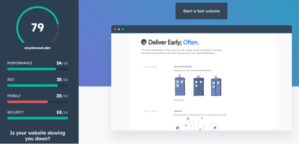
Analysing your website with Hubspot Website Grader
A snapshot report for anunknown.dev is shown below click here to generate a new report.

I recently fix an issue on mobile where the width was not correcltly limitedo the screen width (and would "overhang" allowing a scroll right, that I did not want).
Still some work to do, as summarized below.
| Category | Performance | Current | Recommendation |
|---|---|---|---|
| Performance | Image Size | No | Yes. Use responsive images or SVGs to optimize your images for different screen sizes. |
| SEO | Descriptive Link Text | No | Yes. Use descriptive link text that tells visitors what they'll see if they click the link. |
| Mobile | Tap Targets | No | Yes. Tap targets (e.g., links and buttons) should be at least 8px apart from each other, and at least 48px wide and 48px tall so they are clickable for mobile users. |